
1Password B2B Password Manager Education Campaign
Role: Art Direction, Systems Design
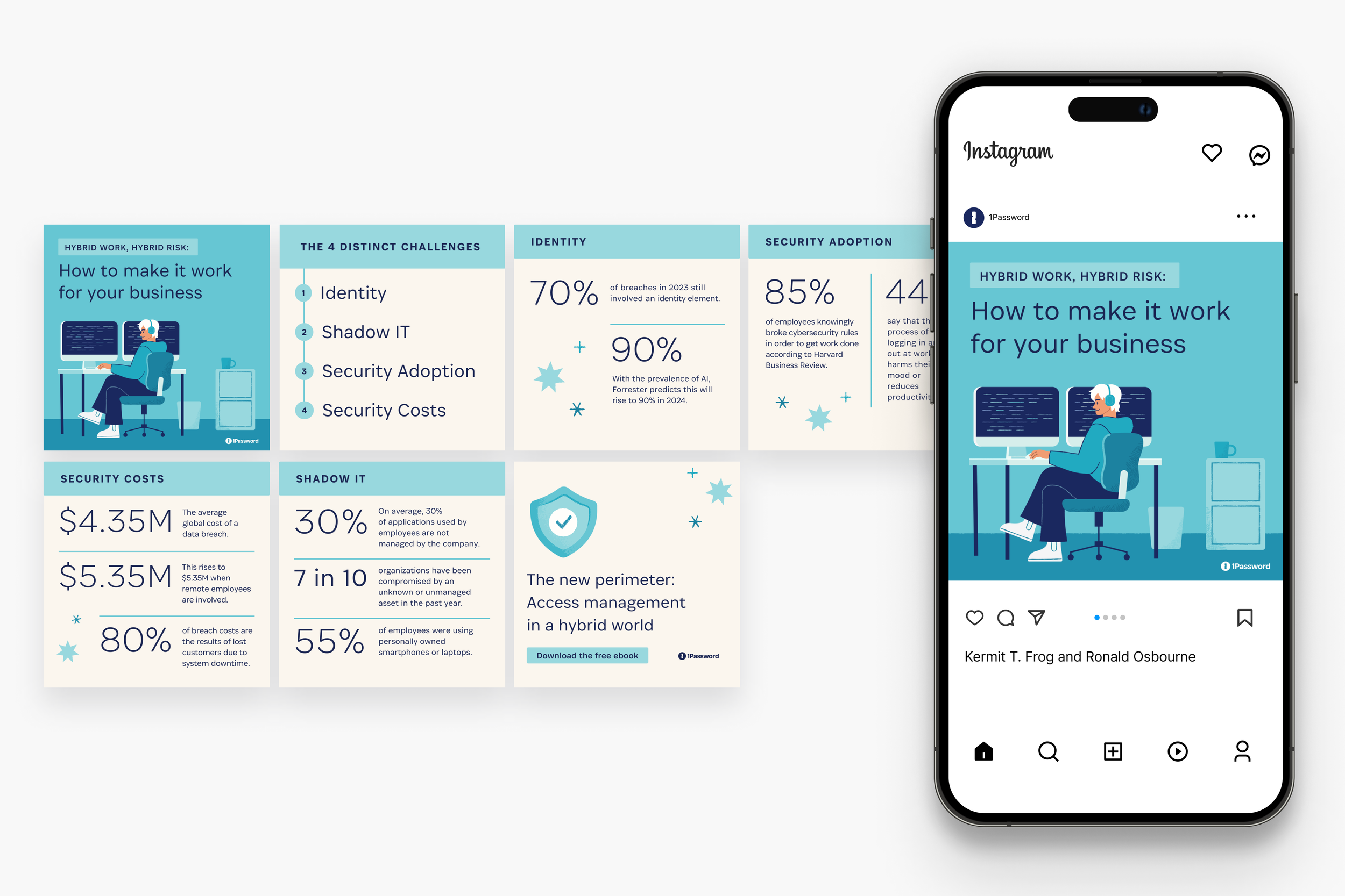
As part of 1Password’s educational outreach, they have a program that teaches business consumers about the value of a password manager in protecting company data, especially as it relates to the ever-evolving work landscape. The campaign is meant to run continuously, with downloadable education guides as the centerpiece of the campaigns. It also includes accompanying blog posts, advertisements, social media posts, and landing page assets. These guides are released every few months to keep these topics at the top of business consumer’s minds.
Because of the volume of work, my task as senior brand designer was to create a scalable, easily repeatable design system that fit within 1Password’s current brand.
My first step was to do research. This included conducting a competitive analysis, looking at other design systems for similar guides and determining what they did well and why. I then asked what from those systems could be applied, if at all, within our brand. I started with the cover, since the cover design would inform the rest of the system. I collected many examples from other brands and used that as a stepping stone.

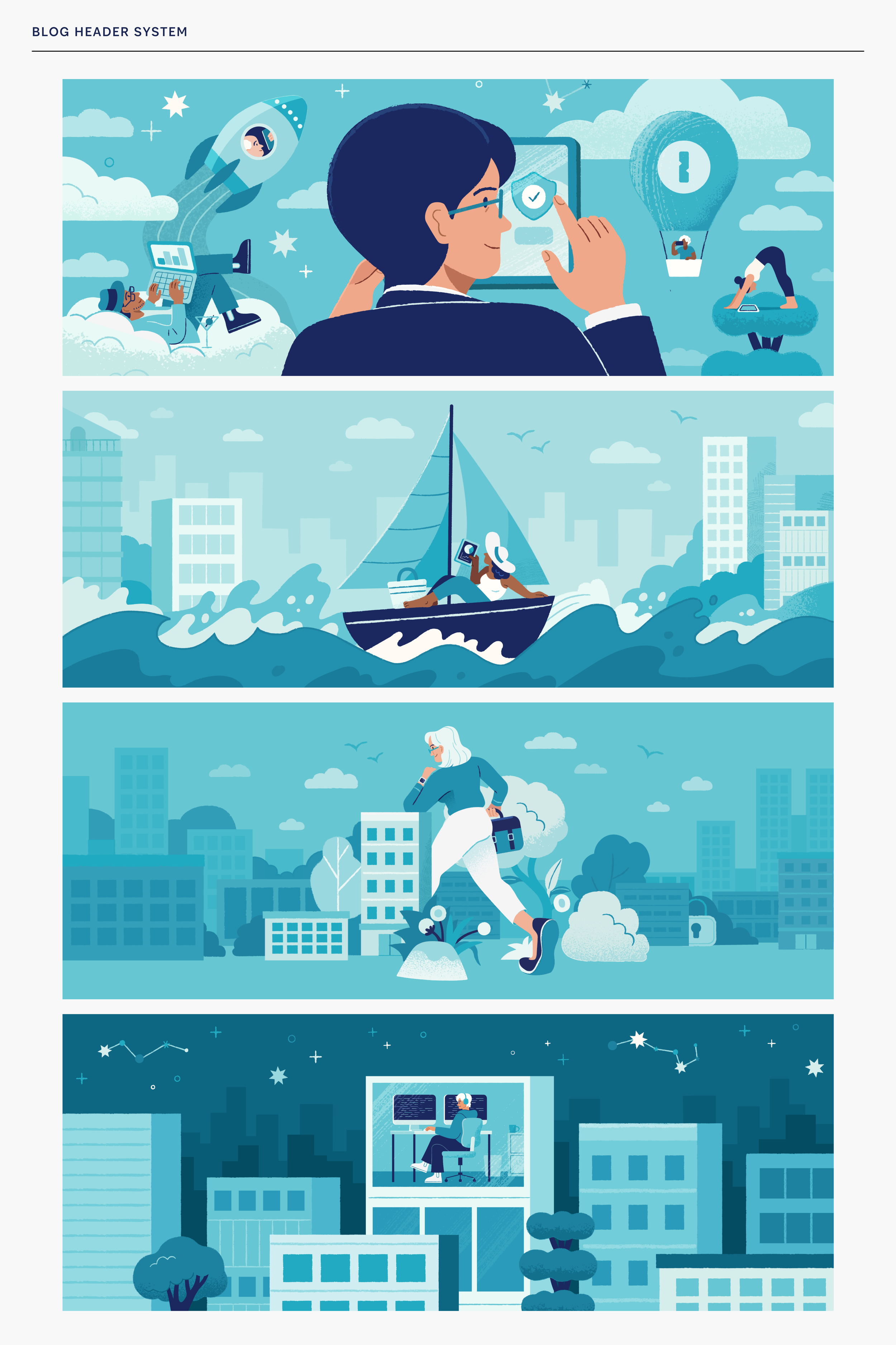
What I discovered was that the best systems had a limited palette for each book. There might be multiple colors for the entire brand, but best practice used only one to three colors for the book. They also used the same type of images for the cover - be it a pattern, an illustration style, or an icon in the same spot every time.
The first decision that I then made was that I would stay within 1Password’s core brand palette, but choosing only one colorway per book, plus our neutral colors (“biscuit” and “intrepid blue”). I had previously worked with another brand designer on developing colors for our brand system and was eager to apply them to this project. This would reduce decision making per book system but also add cohesiveness to the entire campaign.

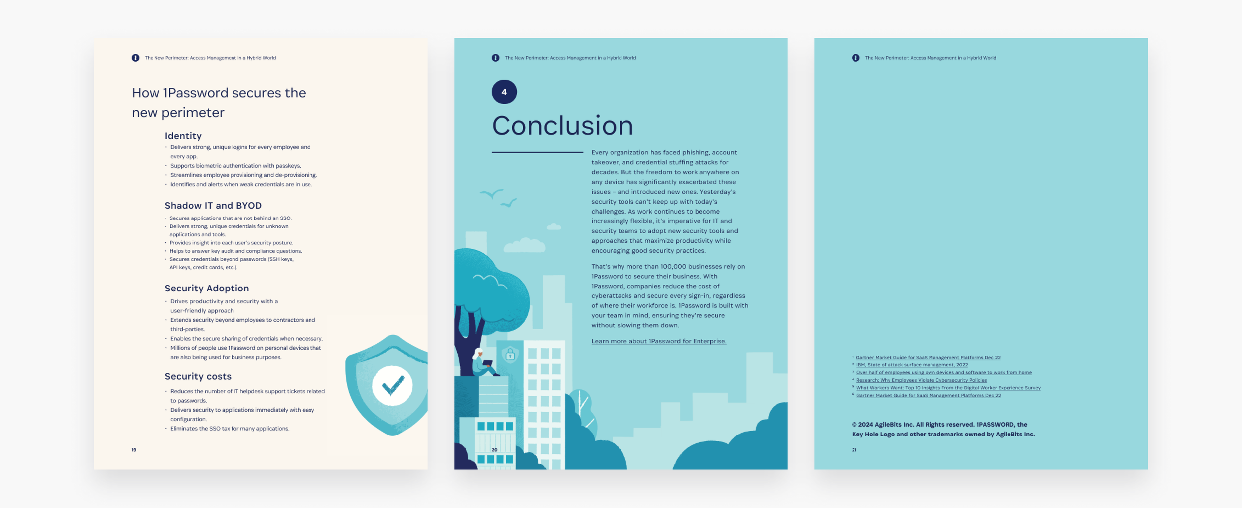
Additionally, based on other work illustrators on the team had done, as well as the fact that an illustrated system is a core part of the 1Password brand, I decided to develop an illustrated cover system. As part of this system, I decided to use a modular illustration system. Each illustration is based on the subject matter of the particular ebook, and can be taken apart and reconfigured, not only within the book, but across many assets such as advertisements, blogs, and social media posts. These assets could then be handed off to other designers to complete. I worked in conjunction with 2 staff illustrators to develop these illustrations.


I also experimented with grid layouts and eventually landed on a flexible grid system that could accommodate many different types of copy. Typically, the subject matter of each book will be different lengths, and have different information architecture. I wanted an elegant solution that could flex and change in order to allow for this amount of variation. I also wanted a system that allowed for enough white space to have the copy be breathable, and to allow for large type as well as illustrations to be present on the page.
The type scale was another important core component of the ebook system. I relied on a figma plugin which ran the numbers of several mathematical type systems, finally landing on Major Third. This helped determined my H1, H2, paragraph styles and so on.


The final result was an elegant, easily repeatable system that was easily scaled for a full length ebook.